10 UX Mistakes That Kill Online Casino Conversions
By Zenix UX · June 23, 2026 · 11 min read
We get called in on a lot of casino redesigns where the games, the licensing, and the bonus structure are all fine — the platform is just losing players somewhere between the homepage and the first deposit, and nobody can quite say where. Almost every time, it's one or more of the same ten mistakes.
None of these are exotic problems. They're common precisely because they're easy to fall into when a platform grows feature by feature without anyone stepping back to look at the full player journey.
The 10 Mistakes We See Most
- A cluttered lobby with no clear categories. When every game competes for the same visual weight, players default to scrolling instead of deciding — and most give up before they find something they actually want to play.
- A registration flow with five or more steps. Every additional field or screen between "I want to sign up" and "I'm in" costs you a percentage of that traffic, permanently.
- A confusing deposit or withdrawal process. If a player has to guess which button actually moves money, or can't find their transaction history, you've created exactly the doubt that makes them abandon.
- No game search or filters. A 2,000-game catalog with no way to filter by provider, volatility, or theme isn't a feature-rich lobby — it's an unusable one.
- Missing trust signals. No visible license information, no security badges, no payout-speed indicators — all of it reads as risk to a first-time visitor deciding whether to enter card details.
- A poor mobile experience. Tap targets too small, text requiring pinch-zoom, or a desktop layout simply squeezed into a phone frame will lose the majority of your traffic outright.
- Aggressive popups and bonus overload. Stacking three promotional modals before a player has even seen a game reads as desperation, not generosity.
- No recently-played or favorites section. Returning players shouldn't have to re-search for the same three slots every single session.
- Ignoring responsible gaming UI. Beyond the compliance risk, players increasingly read the absence of visible limits and self-exclusion tools as a red flag about the operator's legitimacy.
- Inconsistent visual design across sections. When the lobby, the cashier, and the live casino all look like they were built by three different teams — which, often, they were — it undermines trust in the platform as a whole.
How to Audit Your Own Casino UX
You don't need a formal research study to catch most of this. Open your platform on a phone, on mobile data rather than office wifi, and try to do three things a real player would: find a specific type of game, make a small deposit, and locate your responsible gaming settings. Time yourself. If any of the three takes more than about 20 seconds or more than four taps, you've found a mistake worth fixing.
It's also worth watching a genuinely new user attempt this — not a colleague who already knows where everything is, but someone encountering the platform cold. The friction they hit in the first sixty seconds is almost always the friction costing you the most conversions.
Fixing These Without a Full Rebuild
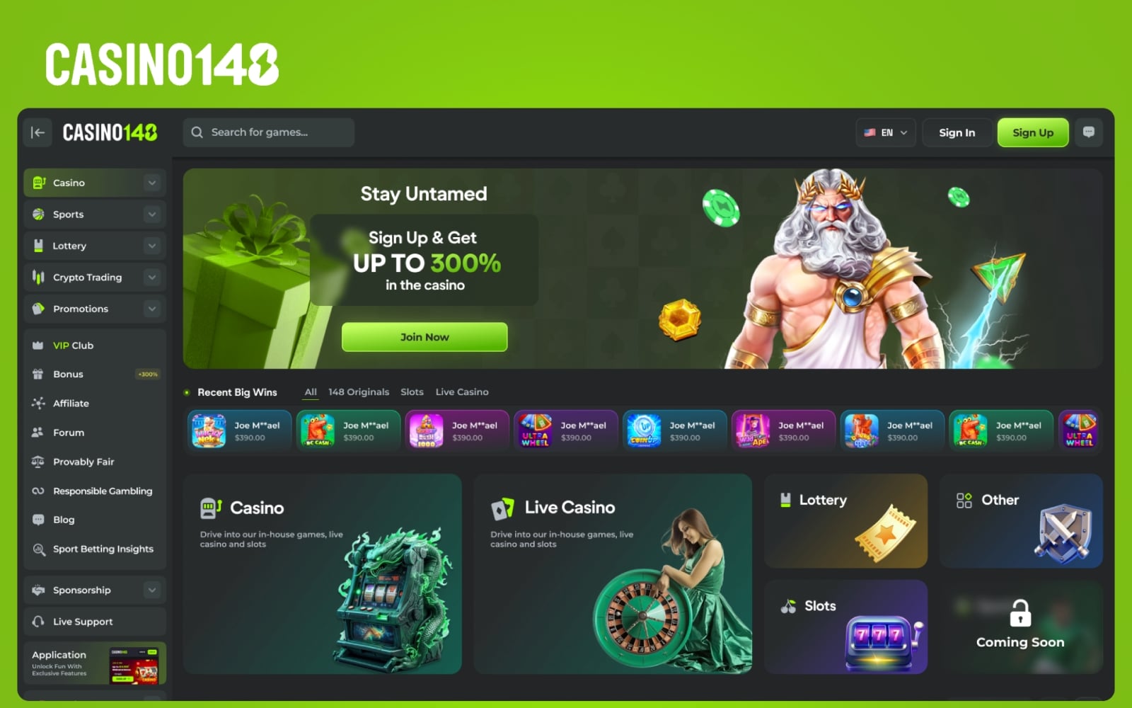
The good news is that most of these ten mistakes don't require rebuilding the platform from scratch. Lobby categorization, search and filtering, and trust-signal placement can usually be redesigned and shipped as a focused sprint on top of your existing tech stack. We took exactly this approach on Casino 148 and POWBET — targeted redesigns of the highest-friction screens rather than a ground-up rewrite.
The mistakes worth treating as a bigger project are usually numbers 3 and 10 — a genuinely broken cashier flow, or visual inconsistency deep enough that it needs a real design system to fix properly, as we built for 1win.
Where to Go From Here
If even a couple of these sound familiar, they're worth prioritizing before you spend another dollar on acquisition — fixing the leak is almost always cheaper than filling it with more paid traffic. We design and redesign iGaming platforms specifically around this kind of conversion audit, so reach out if you want a second set of eyes on where your platform is losing players.
Need help with your casino's conversion flow?
Let’s talkRelated projects
See it in practice
iGaming · UI/UX Design
Casino 148
A luxurious online casino interface with a VIP-tier design language — rich dark palette, gold accents, and immersive game lobbies designed to maximize session time and player retention.
View case study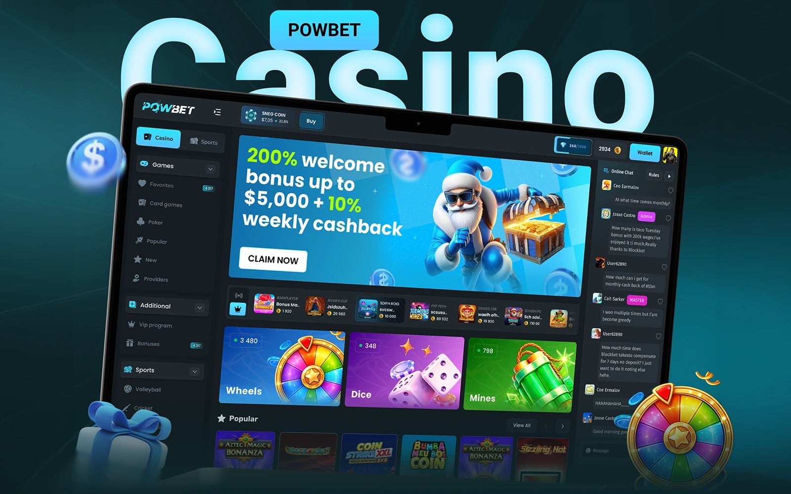
iGaming · UI/UX Design
POWBET — Casino Gambling Website
A modern, dark-themed casino gambling website with a powerful game library, crypto payment integration, and a sleek promotional system — designed for global player acquisition.
View case study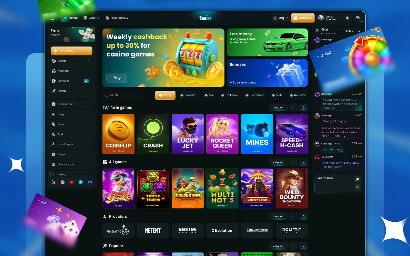
iGaming · UI/UX Design
1win — Casino Gambling Interface
A bold, high-energy casino gambling interface for 1win — featuring an immersive game lobby, sportsbook integration, and promotional systems designed for high player retention.
View case studyMore articles
Keep reading

What Makes Great iGaming UI Design? A Complete Guide for Operators
The difference between a casino players love and one they abandon in 30 seconds comes down to interface design. Here's what separates the best from the rest.

How to Design a Telegram Casino Bot That Players Love
Telegram mini-apps are the next frontier for iGaming. Here's how to design casino bots that feel native, fast, and addictive.

Designing iGaming Platforms for European Markets: UX Meets Compliance
European iGaming isn't just about great design — it's about meeting MGA, UKGC, and local regulations through the interface itself.

Written by Zenix UX
A Canada-based UI/UX design & web-development studio building for iGaming, fintech, and product teams across Europe and beyond.