Node Crypto Wallet
Making crypto feel as safe and simple as your banking app
Client
Node Crypto Wallet
Industry
Crypto
Timeline
8 weeks
Platform
Web & Mobile
The brief
Where we started
Node needed a multi-platform crypto wallet interface that could bridge the gap between crypto-native power users and mainstream adopters — making digital asset management feel as natural as checking your bank balance.
Design a wallet that passes the 'would my parents understand this?' test
Create a dual-mode interface: simple view for everyday use, advanced for power users
Build trust through clear confirmation flows and transparent transaction displays
The challenge
What we were up against
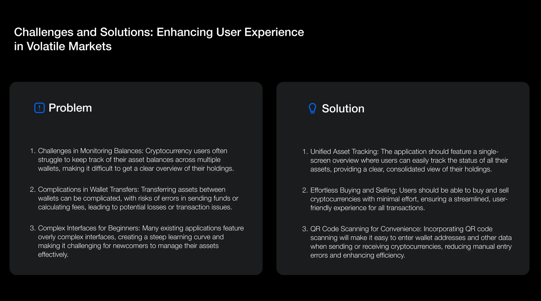
Crypto wallets have an accessibility problem. Most interfaces are designed by developers for developers — packed with hexadecimal addresses, gas fee sliders, and blockchain jargon that terrifies mainstream users. Yet dumbing down the interface alienates the power users who drive volume and evangelize the product.
Node needed both: an interface simple enough for someone's first crypto purchase, with a hidden depth that satisfies a DeFi-native user managing assets across 5 chains. The security UX was equally critical — users need to feel their money is safe without being overwhelmed by security warnings.
3
user personas — Newcomer, Holder, Trader — each needing a fundamentally different depth of interface
What was at stake
If Node shipped a single generic interface, it would either scare away first-time buyers with jargon or bore away power users with oversimplification — losing the audience on both ends of the spectrum.
Our approach
How we tackled it
We designed for three very different comfort levels under one product, using a 'zoom' model that reveals depth only when a user asks for it.
Step 1
User Segmentation
We identified three distinct user personas: the Newcomer (just bought their first Bitcoin), the Holder (buys and holds, checks weekly), and the Trader (active DeFi, multi-chain, daily user). Each persona got a tailored experience layer.
Step 2
Progressive Disclosure Framework
We designed a 'zoom' interaction model — the default view shows portfolio value, recent activity, and one-tap send/receive. Users can 'zoom in' to advanced features: token analytics, DeFi protocols, cross-chain bridges.
Step 3
Security UX Audit
We mapped every transaction flow and identified 14 points where users need confirmation or warning. We designed a tiered alert system: green (routine), amber (unusual), red (potentially dangerous) — using visual language, not jargon.
Step 4
Multi-Platform Design
Mobile-first design, then adapted to web dashboard. The web version adds portfolio analytics and multi-wallet management that doesn't translate to mobile screens.
The solution
The work, up close
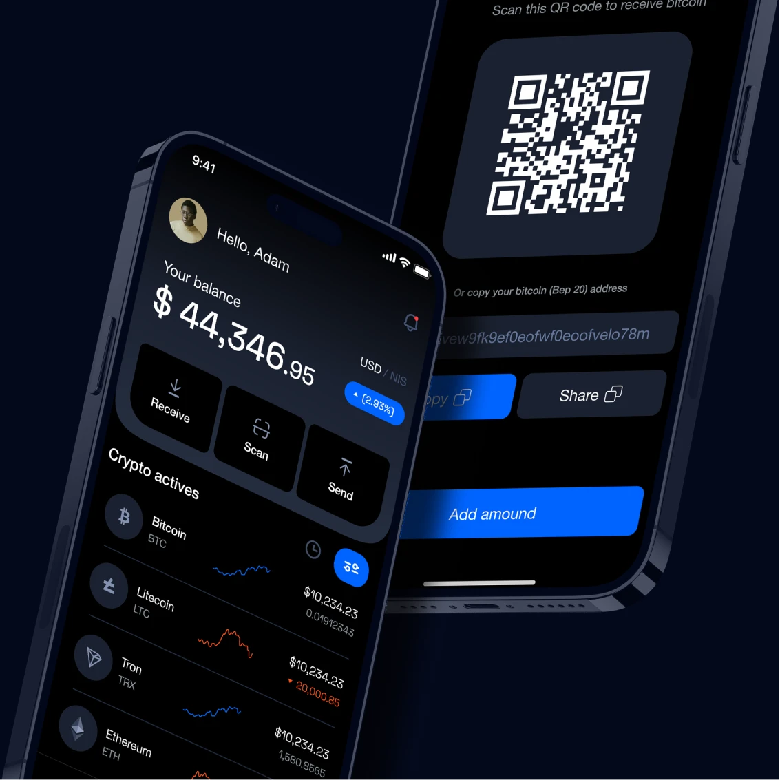
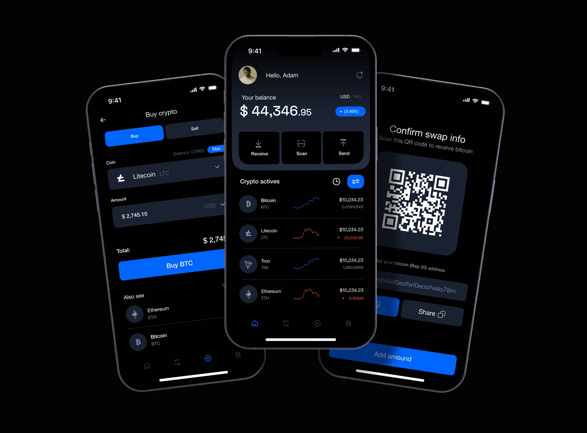
A comprehensive multi-platform wallet design: mobile app (iOS + Android) and web dashboard — covering wallet creation with seed phrase education, portfolio overview with real-time price tracking, send/receive flows with address validation, transaction history with human-readable descriptions, token management with favorite/hide, cross-chain asset viewing, DeFi protocol integration, and security settings with biometric and 2FA.
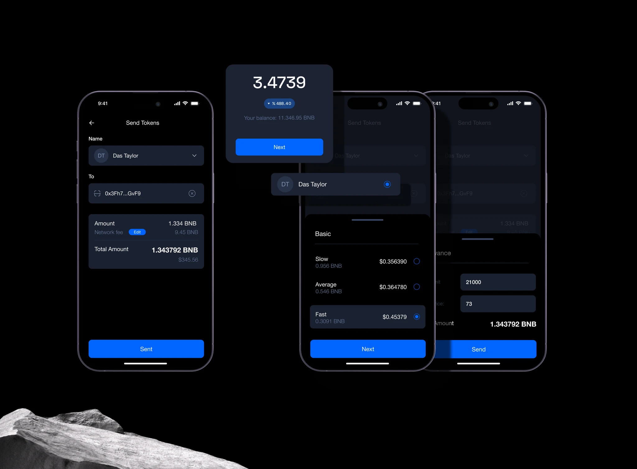
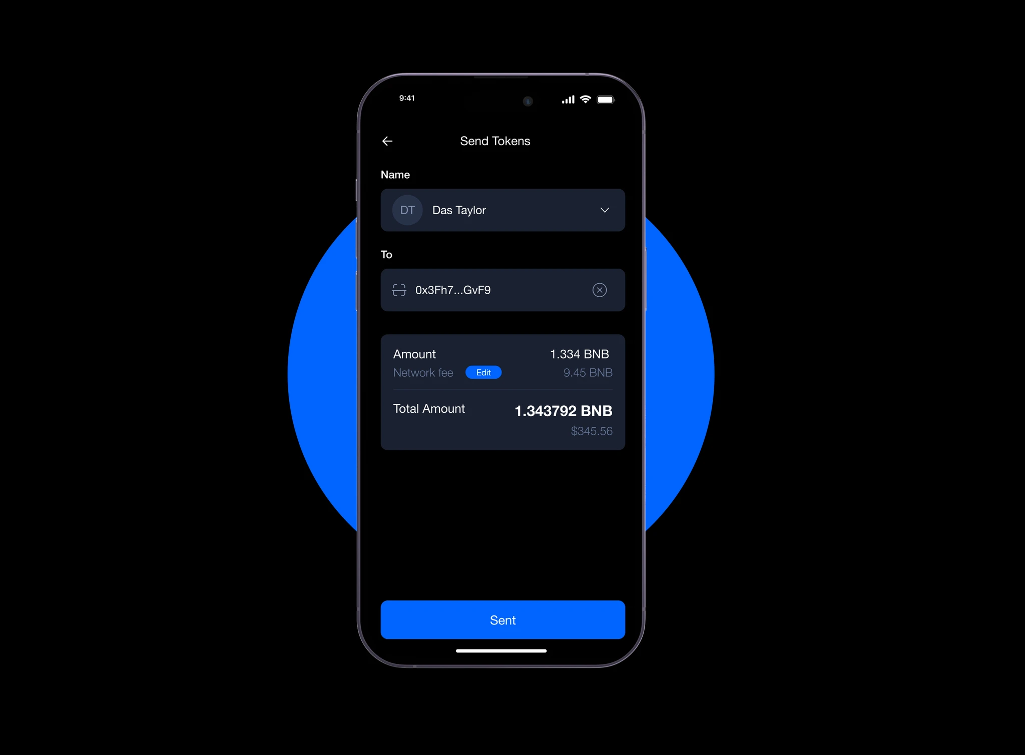
The send flow is the crown jewel: users enter a dollar amount (not crypto), select a recipient from contacts or scan a QR, review a plain-English summary ('You're sending $50 of Bitcoin to Alex'), and confirm with biometrics. Gas fees are shown as a simple 'Network fee: $2.10' — no gwei, no sliders.
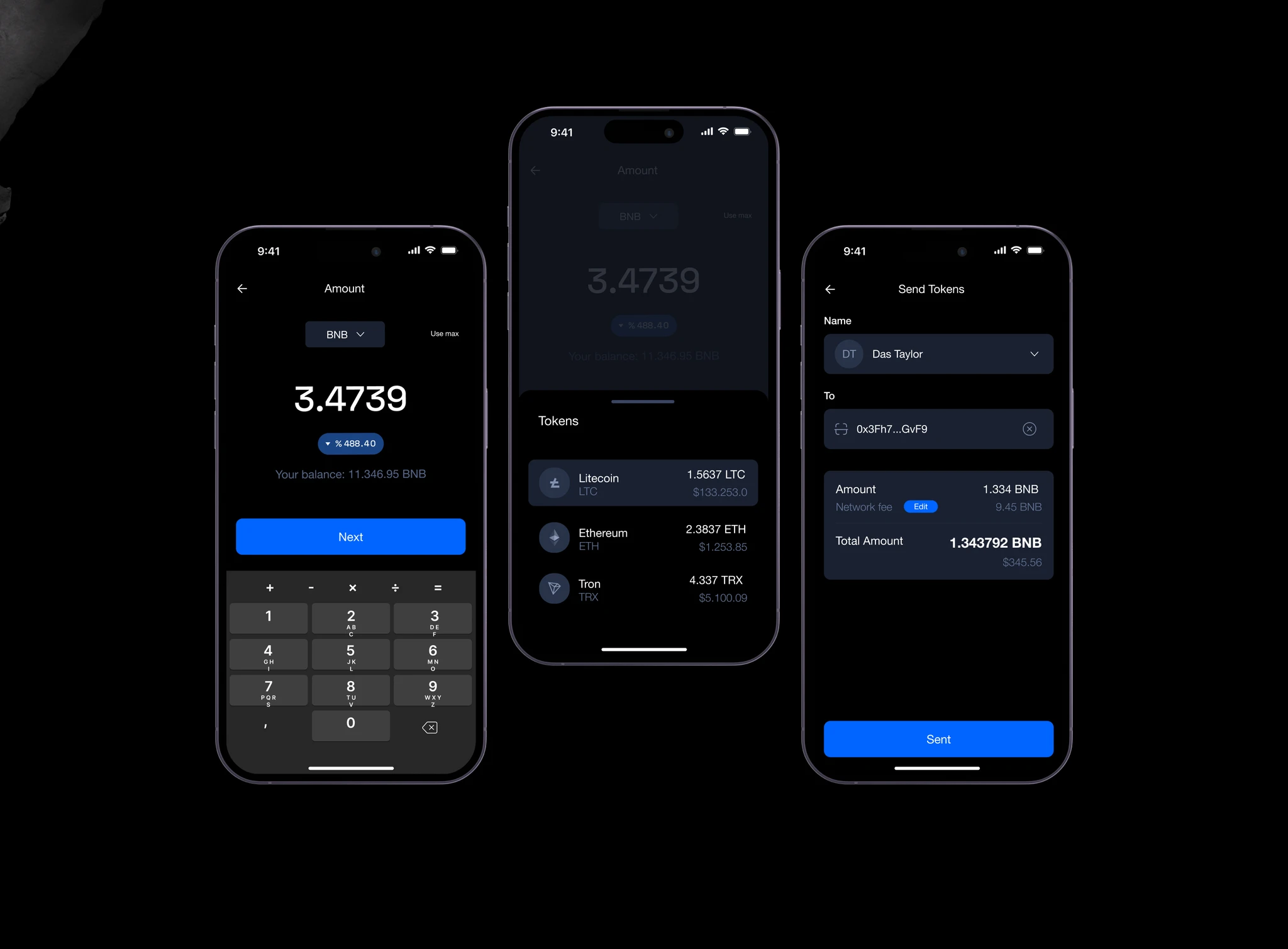
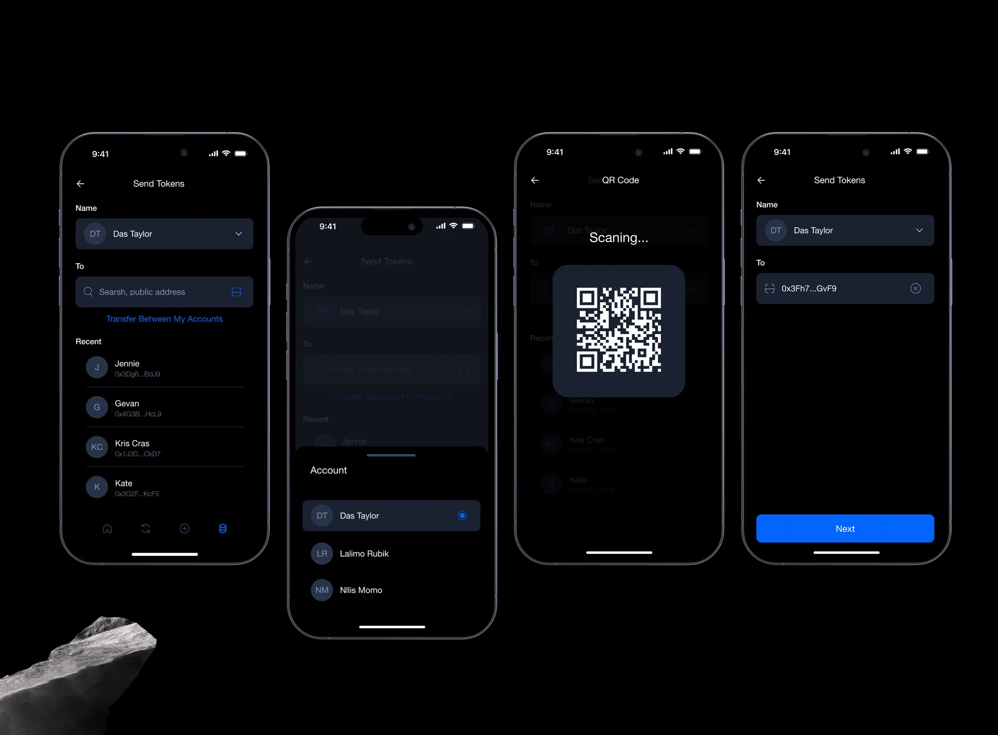
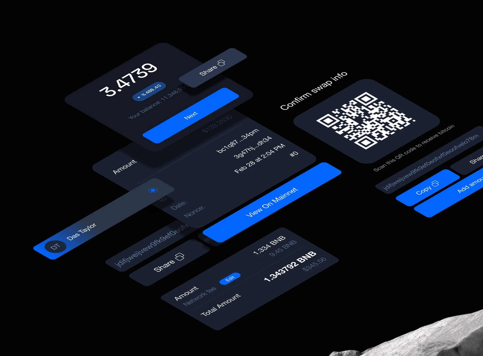
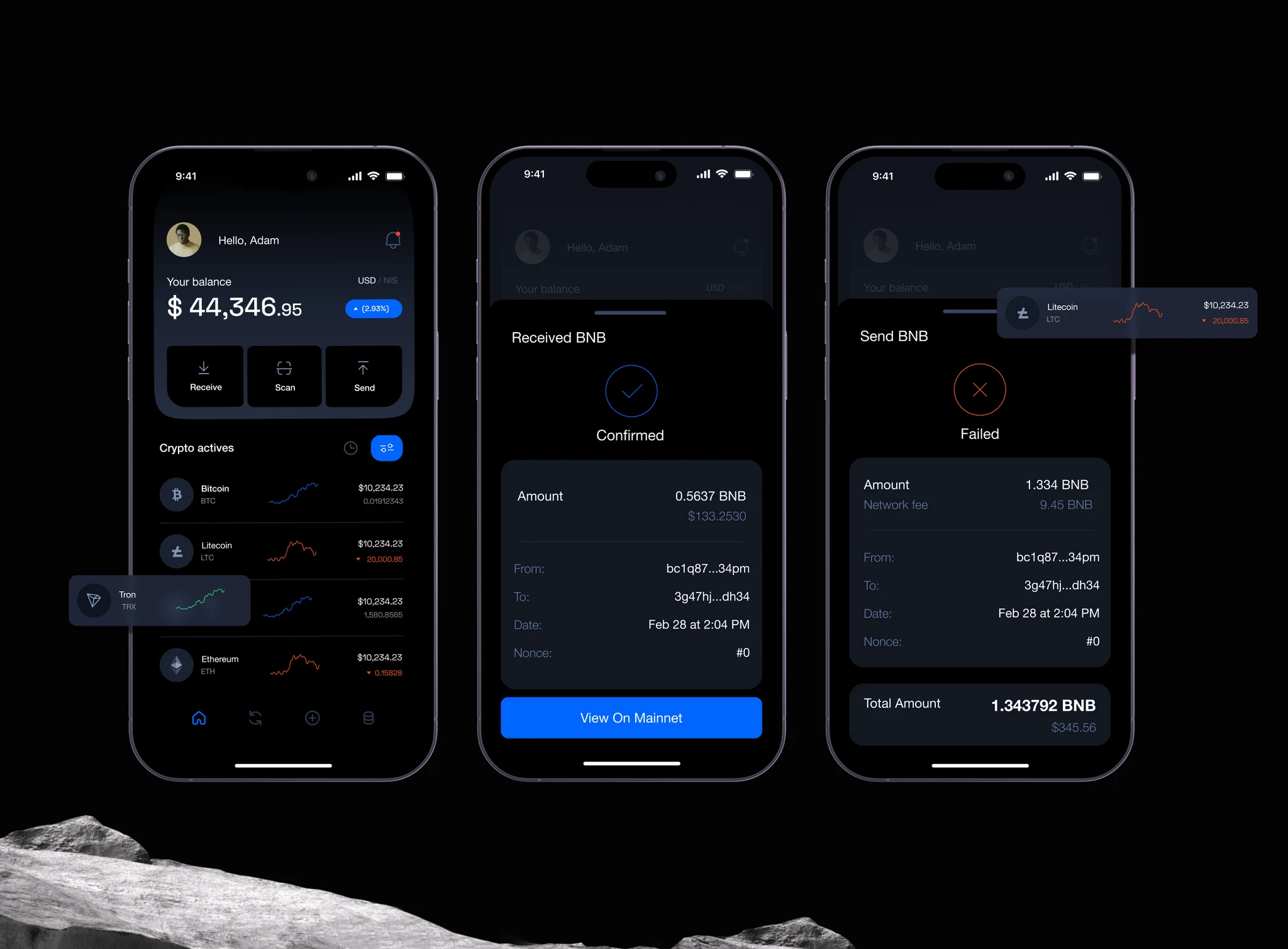
Human-Readable Transactions
Every transaction summary written in plain English: 'Received $120 of Ethereum from 0x...abc' with sender/receiver labels from your contacts.
Simple/Advanced Mode Toggle
One tap switches between a clean portfolio view and a power-user dashboard with charts, analytics, and protocol integrations.
Tiered Security Alerts
Color-coded transaction warnings (green/amber/red) that communicate risk level through visual language, not technical jargon.
Design details
Under the hood
Typography
A clean geometric sans throughout, with tabular numerals for balances and transaction amounts so every number aligns precisely in lists and confirmations.
Color palette
Components
80+ reusable components spanning wallet cards, transaction rows, charts, and confirmation modals.
Responsive design
The simple/advanced mode toggle collapses cleanly between mobile and web — mobile defaults to Simple mode, web defaults to Advanced, both switchable in one tap.
The results
What it delivered
60+ screens across mobile and web platforms
Complete design system with 80+ reusable components
3 user personas with tailored interface layers
Figma prototype covering all critical user flows
Node's wallet interface finally lets the product be judged on its actual strengths — security and multi-chain depth — instead of losing users at the first confusing screen.
“Placeholder client quote — replace with real words before launch.”
Tools & technologies
What we built it with
FigmaFigma PrototypingAdobe Illustrator