Trading Dashboard Design: 15 Best Practices for 2026
By Zenix UX · June 9, 2026 · 14 min read
A trading dashboard has one job that's harder than it sounds: show a trader everything they need to make a fast, correct decision, and nothing they don't. Get the balance wrong in either direction — too sparse or too dense — and you've built a dashboard people route around instead of trust.
We've designed dashboards for multi-asset platforms, forex trading tools, and crypto investment interfaces, and the same fifteen practices keep showing up as the difference between a dashboard traders love and one they tolerate.
Information Hierarchy: What Traders See First, Second, Third
- Lead with position, not the market. Portfolio value and today's P&L belong above the fold, before any individual instrument's chart — traders check their own exposure before they check the news.
- Group by task, not by data type. Keep everything related to placing a trade together (chart, order book, order form) instead of scattering charts in one panel and order entry in another.
- Use progressive disclosure for depth. Show headline numbers by default; put historical performance, tax lots, and deep analytics one click away, not competing for space on the main view.
- Keep the same layout across asset classes. A trader switching from forex to crypto shouldn't have to relearn where anything lives.
- Never let critical alerts get buried. Margin calls and stop-outs need visual priority that overrides whatever else is on screen at that moment.
Data Visualization: Charts, Tables, and Real-Time Indicators
- Default to the chart type your users actually trade with. Candlesticks for most active traders, line charts for long-term portfolio views — don't force one style everywhere.
- Make real-time updates visible without being distracting. A subtle flash or color shift on price change works; a jumping, resizing number does not.
- Use color with intention, not decoration. Green and red for gains and losses should be the only saturated colors on the screen — everything else should be quiet enough that the market data reads instantly.
- Tabular data needs tabular numerals. Misaligned decimal points in a price table look like a formatting bug and erode trust in the platform's accuracy, even when the underlying data is correct.
- Sparklines earn their space in list views. A tiny 7-day trend next to a watchlist item tells a trader more in half a second than a static price ever will.
Interaction Patterns: Shortcuts, Layouts, and Alerts
- Keyboard shortcuts aren't a nice-to-have for active traders — buy/sell hotkeys and quick order-type switching are table stakes for anyone trading more than a few times a day.
- Let users rearrange the workspace. Every trader's priority panel is different; a fixed layout guarantees frustration for a meaningful chunk of your users.
- Alerts should interrupt exactly as much as their urgency warrants. A price-target notification is not the same severity as a margin call, and the UI needs to visually communicate that difference.
- Confirm destructive actions, but don't over-confirm routine ones. A market order at a familiar size shouldn't need the same friction as closing an entire position.
- Design for the return visit, not just the first one. Saved watchlists, layout persistence, and recently viewed instruments matter more to retention than any onboarding flow.
Dark Mode Isn't a Preference — It's a Requirement
Active traders spend hours at a time staring at charts, often across multiple monitors. A bright white dashboard isn't a stylistic choice at that point, it's eye strain. Every trading platform we design ships dark-mode-first, with light mode as the secondary option rather than the default — the inverse of most consumer software.
Typography in Data-Dense Interfaces
Numbers and labels need different typefaces doing different jobs. We use a monospace or tabular-figure font for anything numeric — prices, balances, percentages — so digits align cleanly in columns and don't shift width as they update. Labels and navigation get a standard sans-serif, keeping the interface legible without turning every screen into a spreadsheet.
Mobile Trading: What to Keep, What to Cut
Mobile trading dashboards fail when they try to cram the desktop experience onto a six-inch screen. The fix isn't shrinking everything — it's deciding what a trader actually needs to do from their phone: check positions, react to an alert, place a quick order. Deep analytics, multi-chart layouts, and complex order types can live on desktop without apology.
Bringing It Together
None of these fifteen practices work in isolation — a dashboard with perfect data visualization but the wrong information hierarchy still fails traders in the moment that matters most. That's the balance we design for on every trading and fintech engagement: dense enough to be useful, clear enough to trust at a glance.
If you're building or rebuilding a trading platform and want a dashboard traders actually rely on, let's talk about your product and where it currently loses people.
Need help with your trading platform's dashboard?
Let’s talkRelated projects
See it in practice
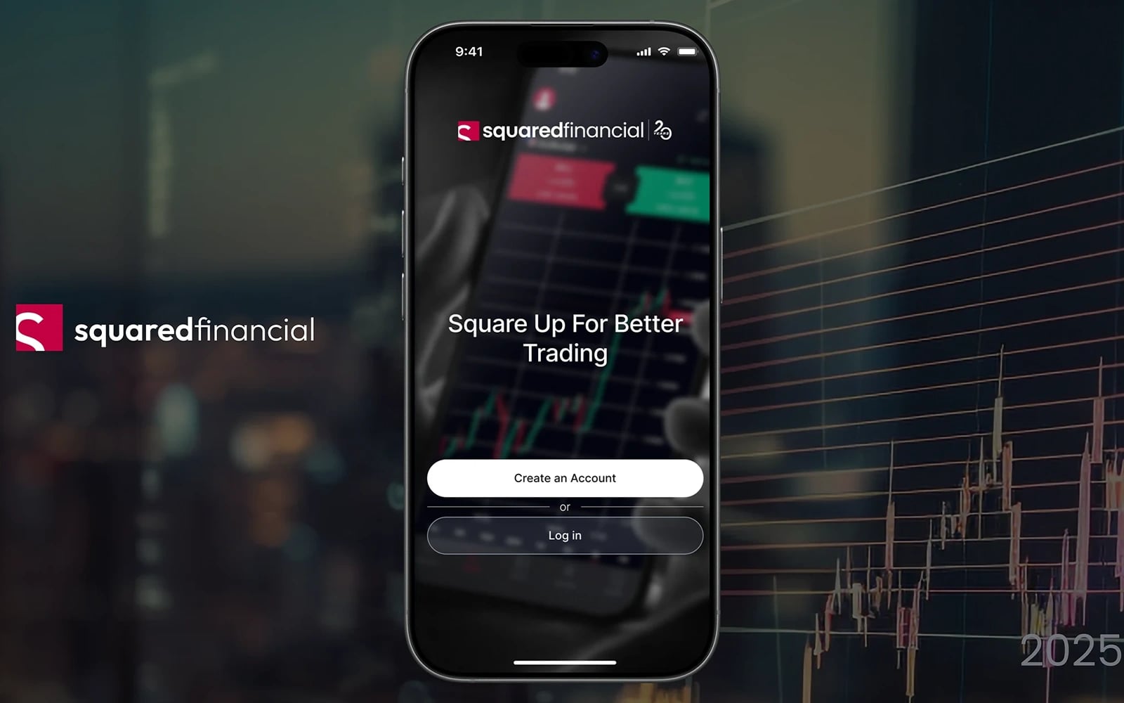
Fintech · UI/UX Design
Squared Financial — Trading Platform
A professional multi-asset trading platform interface — forex, commodities, indices, and crypto — designed for clarity, speed, and trader confidence.
View case study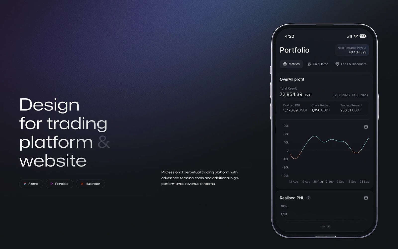
Fintech · UI/UX Design
XCore Trading Platform
A high-performance trading dashboard designed for active traders — real-time charts, advanced order types, and multi-market coverage in one unified interface.
View case study
Crypto · UI/UX Design
Alpha Innovate
A bold, futuristic crypto investment platform interface — designed to empower traders with real-time analytics, portfolio tracking, and seamless token management in one unified dashboard.
View case studyMore articles
Keep reading

How to Design a Crypto Exchange That Traders Actually Trust
In crypto, trust is everything — and trust starts with the interface. Here's how to design an exchange that feels safe, fast, and professional.
Forex Trading Platform Design: What Retail Traders Actually Need
Most forex platforms are designed for institutional traders. Here's how to design one that retail traders understand and stick with.
Payment Gateway UX: Designing Checkout Flows That Convert
The checkout flow is where money is made or lost. Here's how to design payment experiences that minimize friction and maximize conversions.

Written by Zenix UX
A Canada-based UI/UX design & web-development studio building for iGaming, fintech, and product teams across Europe and beyond.