Travel Partner
A trip-planning platform that feels like Pinterest met Airbnb
Client
Travel Partner
Industry
Travel / Tourism
Timeline
5 weeks
Platform
Web & Mobile
The brief
Where we started
Travel Partner needed a platform that inspired wanderlust while staying genuinely functional for planning — most travel sites are cluttered with ads and options, and the goal was a clean, visual, browsing-first experience.
Make destination browsing feel inspirational, not like scanning a listings database
Build a visual trip-planner that lets users assemble itineraries the way they'd build a mood board
Design a responsive companion experience so planning continues seamlessly on mobile
The challenge
What we were up against
Travel Partner needed a platform that inspired wanderlust while staying functional. Most travel sites are cluttered with ads and options. The goal was a clean, visual, Pinterest-meets-Airbnb browsing experience that makes discovering a destination feel like the fun part of travel planning, not the tedious part.
Most travel platforms treat discovery and booking as fully separate modes — a beautiful inspiration blog on one side, a dense booking engine on the other. Travel Partner needed those two experiences to feel like one continuous flow, from first daydream to confirmed itinerary.
1
continuous flow from destination discovery to itinerary booking, replacing the typical inspiration-blog-vs-booking-engine split
What was at stake
If discovery and booking stayed disconnected, Travel Partner would lose users at the exact handoff point where competitors' cluttered booking engines usually cause abandonment.
Our approach
How we tackled it
We studied how people actually browse travel inspiration on Pinterest and Instagram, then designed the destination feed to match that behavior.
Step 1
Discovery Behavior Research
We studied how people actually browse travel inspiration on Pinterest and Instagram, then designed the destination feed to match that visual, scroll-friendly behavior.
Step 2
Masonry Destination Feed
Stunning destination photography in a masonry grid leads the experience, replacing the dense listing-style layout typical of travel sites.
Step 3
Visual Trip-Builder Design
A trip-builder lets users assemble itineraries visually — dragging destinations and activities into a plan — rather than filling out a linear booking form.
Step 4
Simplified Smart-Filter Search
Search was simplified with smart filters that narrow results conversationally, reducing the overwhelming options typical of travel booking sites.
The solution
The work, up close
The full travel platform includes a destination discovery feed, detailed destination pages with local guides, a trip planner/builder, a booking flow, a user profile with saved trips, and a responsive mobile companion app design.
The masonry discovery feed and visual trip-builder share one continuous flow — a user can move from 'this looks amazing' to 'this is in my itinerary' without ever hitting a jarring transition into a separate booking-engine interface.
Masonry Discovery Feed
A Pinterest-style masonry grid of destination photography replaces the dense listing layout typical of travel sites, making browsing feel inspirational.
Visual Trip Builder
Users assemble itineraries by visually arranging destinations and activities into a plan, rather than filling out a linear multi-step booking form.
One Continuous Discovery-to-Booking Flow
Discovery and booking share one visual language and flow, eliminating the jarring handoff typical of travel sites that separate inspiration from booking.
Design details
Under the hood
Typography
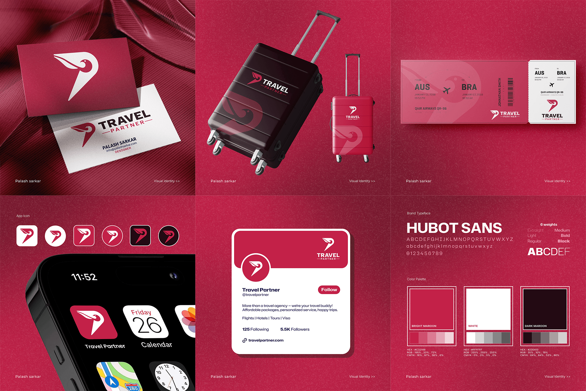
An editorial serif for destination headlines paired with a clean sans for practical trip details — travel-magazine feel with booking-engine clarity.
Color palette
Components
32-component system spanning the discovery feed, trip builder, and booking flow.
Responsive design
The masonry feed and trip builder both adapt to a single-column, swipe-friendly layout on mobile without losing the visual browsing feel.
The results
What it delivered
32-component design system across discovery, planning, and booking
One continuous discovery-to-booking flow replacing a typical blog/booking split
Responsive mobile companion design shipped alongside web
5-week full-platform UI/UX turnaround
A travel platform that people WANT to browse — even when they're not booking. Visual, intuitive, and designed to convert dreamers into bookers.
“Placeholder client quote — replace with real words before launch.”
Tools & technologies
What we built it with
FigmaFigma Prototyping